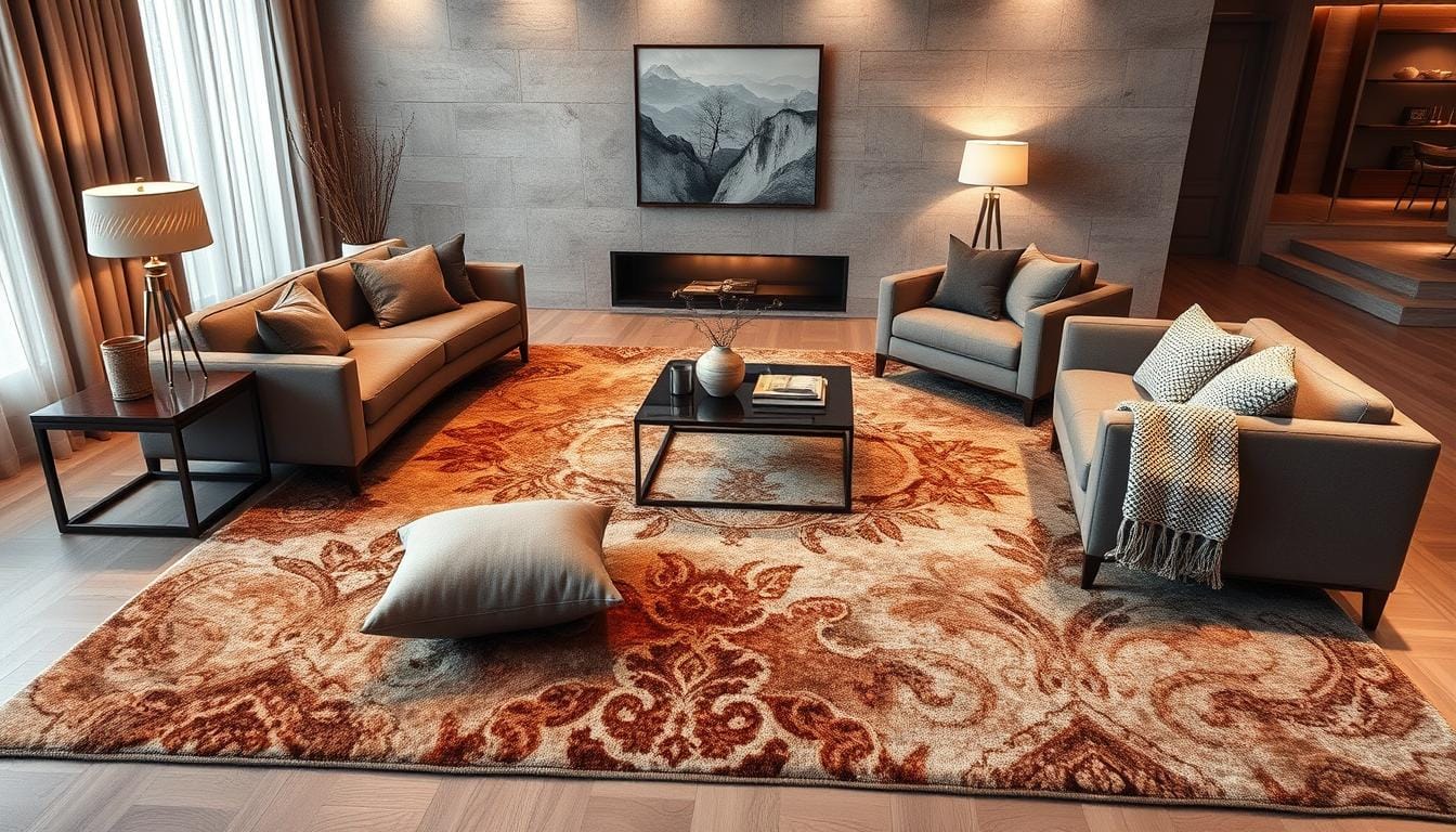
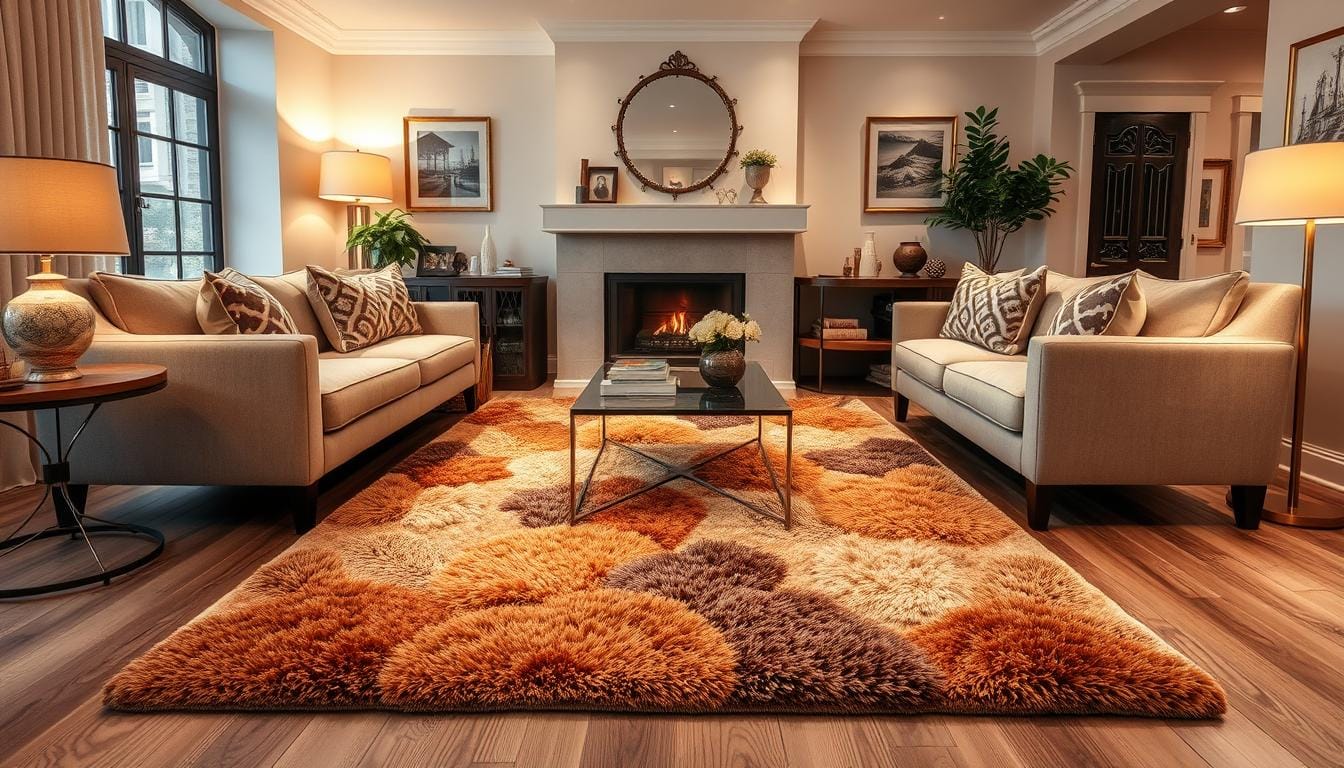
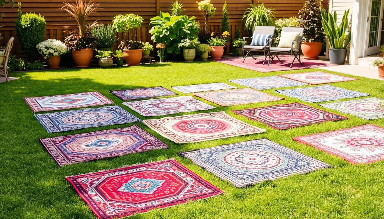
Exploring how to match colors to complement the overall design of the room aesthetically.
I love how color can change a room’s feel. It can make us feel certain ways and set the mood. Today, I want to share tips on matching colors to enhance your living space.
Choosing colors is key to your room’s look. Whether you like cool blues or warm terracottas, your colors matter. Knowing color theory and what we like can help you create beautiful spaces that show off your style.
We’ll dive into color coordination, including how to pick colors that work well together. We’ll also look at seasonal trends and how to mix them with timeless choices. Get ready to see your living space transformed into a design masterpiece.

Table of Contents
Understanding Color Theory Fundamentals in Interior Design
As an interior designer, knowing color theory basics is key. It helps create spaces that look good and feel right. Color theory explains how different colors work together, guiding us in picking and mixing colors.
The Science Behind Color Perception
The eye sees color through light and special cells in the retina. Things like light, texture, and how each person sees colors play a part. Knowing this helps us choose colors that make a space feel just right.
Primary, Secondary, and Tertiary Colors
The color wheel is color theory’s base, with 12 main hues. Red, blue, and yellow are primary colors, as they can’t be mixed. Secondary colors like orange and green come from mixing two primaries. Tertiary colors, like red-orange, mix a primary with a secondary, creating softer shades.
The Psychology of Color Choices
Colors can make us feel certain ways and affect our actions. Green makes us calm, while red energizes us. Knowing this helps us design spaces that match the mood we want.
By learning color theory, designers can pick the right colors for any space. This makes spaces that look great and meet our clients’ needs.
| Color | Psychological Associations | Interior Design Applications |
|---|---|---|
| Red | Passion, energy, excitement | Dining rooms, accent walls |
| Blue | Calmness, productivity, trust | Home offices, bedrooms |
| Yellow | Happiness, optimism, creativity | Sunrooms, children’s spaces |
| Green | Serenity, nature, balance | Living rooms, bathrooms |
| Purple | Luxury, creativity, spirituality | Meditation rooms, home spas |
“Color is to the eye what music is to the ear.”
– Louis Chevreul
Creating Harmonious Color Palettes for Your Space
Creating a beautiful interior design starts with the right color palette. Understanding color harmony helps make spaces feel cohesive and intentional. Two key ways to achieve this are monochromatic schemes and analogous schemes.
Monochromatic schemes use different shades of one color. This creates a calm and unified look. Analogous schemes use colors next to each other on the color wheel, like blue and green. These schemes add interest while keeping the space cohesive.
Choosing colors depends on their context. The same color looks different with different surroundings and lighting. By focusing on both individual colors and how they work together, you can create a space that looks great and feels harmonious.
| Color Scheme | Description | Key Benefits |
|---|---|---|
| Monochromatic | Using various shades, tints, and tones of a single base color | Creates a unified, calming aesthetic |
| Analogous | Utilizing colors that are adjacent on the color wheel | Offers visual interest while maintaining coherence |
To achieve color harmony, try out different color combinations. Pay attention to how colors work together and with the space’s design. By using color theory and noticing color relationships, you can make a space that shows off your style.
“Harmonious colors enhance each other and create a sense of order in the space.”
The Power of Complementary Colors in Room Design
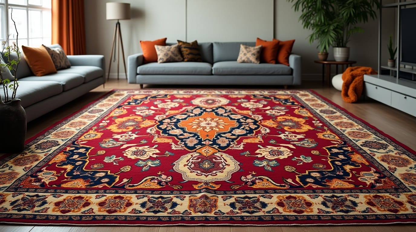
Using complementary colors can make your room look amazing. These colors are opposite each other on the color wheel. They can make your space stand out and catch the eye.
By knowing how to use these colors, you can create incredible room designs. It’s all about understanding how they work together.
Classic Complementary Color Pairs
Some of the most classic and striking complementary color combinations include:
- Red and green
- Blue and orange
- Yellow and purple
These pairs create a strong contrast. This makes the colors seem more alive and intense. They can draw attention and create certain feelings.
Using the Color Wheel for Interior Design
The color wheel is key for using complementary colors in design. It helps you find colors that work well together. By using the wheel, you can try out different colors to get the look you want.
Exploring the color wheel opens up new possibilities for your space. It lets you create something truly unique.
Balancing Warm and Cool Tones
Complementary colors also balance warm and cool tones in your room. Mixing a warm color like red with a cool color like blue creates a nice look. This balance is enhanced by adding neutral shades and textures.
“Color is the keyboard, the eyes are the harmonies, the soul is the piano with many strings. The artist is the hand that plays, touching one key or another, to cause vibrations in the soul.”
– Wassily Kandinsky, Russian painter and art theorist
Color Coordination Ideas for Round Rugs and Living Room Decor
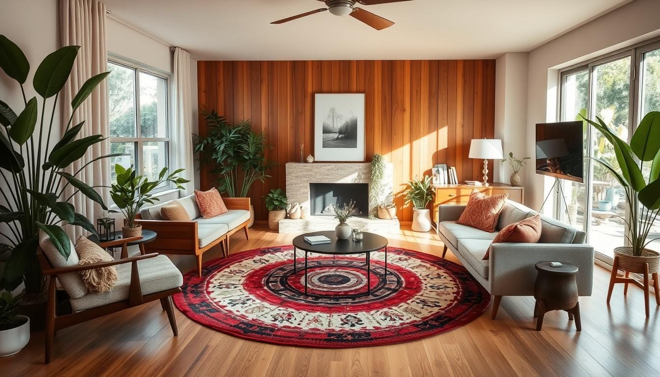
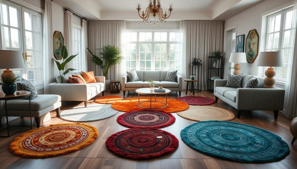
Round rugs can add a unique touch to your living room. They can be the centerpiece, enhancing your room’s look. To make your space look great, match the rug’s color with your room’s decor.
Choose a rug that complements your accent wall. For example, a green accent wall pairs well with a terracotta rug. Or, a bold wall can be balanced by a neutral rug. This creates a calm contrast.
Think about how the rug’s color will match your other furniture and accessories. Using similar colors can make your room look cohesive. Try different colors to find the perfect match for your rug and decor.
| Rug | Size | Material | Color Scheme |
|---|---|---|---|
| Boho Floral Hazel Round Rug | Various | Polyester Blend | Earthy, Multicolor |
| Cole Handmade Tufted Wool Ivory Area Rug | 6′ Round | Wool | Ivory |
| Safavieh Trace Adrasteia Geometric Hexagons Area Rug | 6′ x 6′ | Wool | Multicolor |
| RIANGI Natural Boho Round Jute Rug | 5′ | Jute | Natural |
Matching your round rug with your living room decor can make your space beautiful. It shows off your style and design choices.
Working with Neutral Color Schemes as a Foundation
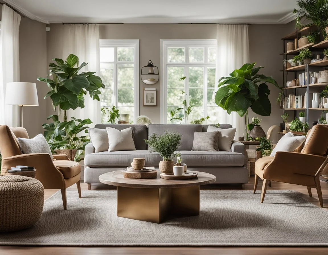
Neutral color schemes are great for interior design. They offer a solid base for creating beautiful spaces. These calm, elegant colors let you show off your design skills and creativity.
Incorporating Texture with Neutral Colors
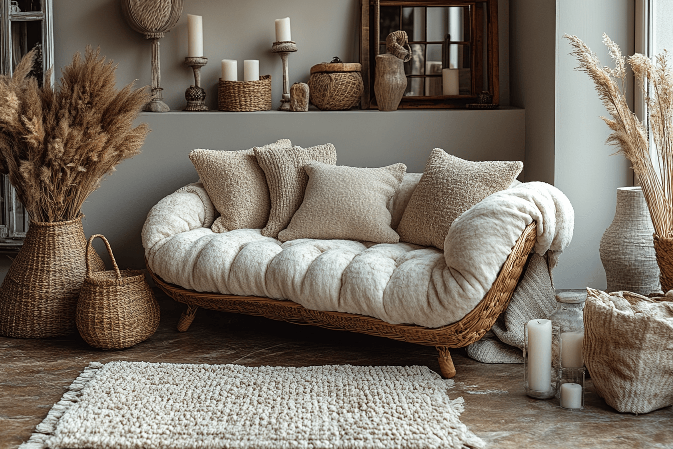
To make your neutral rooms more interesting, add different textures. Try natural fiber rugs like sisal or jute for a warm feel. Using rugs in various shades of the same neutral color can make your floors look dynamic and cohesive.
Adding Depth Through Tonal Variations
Play with tonal variations in your neutral colors. Using different shades of the same color can make your space look sophisticated and interesting. This approach adds depth without being too bold.
Creating Visual Interest with Neutral Palettes
Neutral colors don’t have to be boring. Add patterns, textures, and accent colors to make your design pop. Use artwork, throw pillows, or decorative items that match your neutral theme. These elements can become the room’s highlights.
“Neutral color schemes provide a versatile foundation that allows you to create visually stunning spaces.”
Blending Natural and Bold Color Combinations
Designing a welcoming and eye-catching living space is all about mixing natural colors with bold accents. Start with nature-inspired hues as your base. Then, add vibrant shades to balance and harmonize the look.
Begin with earthy tones like greens, blues, and neutrals. These natural colors calm and ground your space. They prepare it for your bold design choices. Add bold color combinations through accents, textiles, and decor.
Try mixing unexpected colors, like navy blue with rustic accents or soft pastels with bold hues. This color mixing creates unique, captivating spaces. The goal is to balance natural and bold elements well.
| Design Inspiration | Color Palette |
|---|---|
| Dark midnight hues complement soft pink colors in Laura Kirar’s Mexico hacienda. | Midnight blue, soft pink |
| The blue-and-white palette inspired by Oscar de la Renta is prominent in Philip Vergeylen’s Casa de Campo home. | Blue, white |
| Lacquered blue walls and claret velvet sofa create a regal feel in a Virginia living room by Miles Redd and David Kaihoi. | Lacquered blue, claret velvet |
By mixing natural colors and bold color combinations, you can make spaces that are balanced and sophisticated. Let your creativity flow by trying different color mixing techniques. Find the perfect palette that reflects your style and home’s design.
Strategic Color Placement for Visual Impact
In interior design, color placement is key to a room’s look and feel. It can create focal points, guide the eye, and connect rooms smoothly.
Focal Points and Color Distribution
To grab attention, pick a focal point in your room. Use color to highlight it. This could be a bold artwork, a cozy fireplace, or a unique light fixture.
Surround this focal point with colors that complement or match it. This contrast will draw the eye towards it.
Color distribution is also vital. Follow the 60-30-10 rule: 60% of a dominant color, 30% of a secondary color, and 10% of an accent color. This balance prevents any color from dominating, creating a cohesive look.
Creating Flow Between Rooms
It’s important to have a smooth transition between rooms. Use colors that complement or match each other in adjacent spaces. This creates a sense of continuity and harmony.
Color placement can greatly enhance a room’s look and feel. By understanding how to place colors, you can create spaces that are captivating and memorable.
Incorporating Seasonal Color Trends While Maintaining Timeless Appeal
When the seasons change, it’s easy to follow the latest seasonal color trends. But for a design that lasts, finding a balance is key. This balance keeps your space interesting and timeless.
Try adding seasonal color updates with things you can easily swap out, like throw pillows or artwork. This way, you can update your space without a big change. Mixing trendy colors with classic ones makes your space both beautiful and lasting.
Use trendy colors sparingly to keep your space from feeling too busy. This way, you can update your home seasonally. It keeps your space feeling fresh and in style, all while staying true to timeless design.
“Striking the right balance between seasonal color trends and timeless design is the key to creating a space that feels fresh and enduring.”
By keeping up with seasonal color trends but also valuing timeless design, you can always refresh your home. This way, your home stays visually appealing and evolves with the seasons, all while keeping a classic feel.
Lighting’s Impact on Color Selection and Appearance
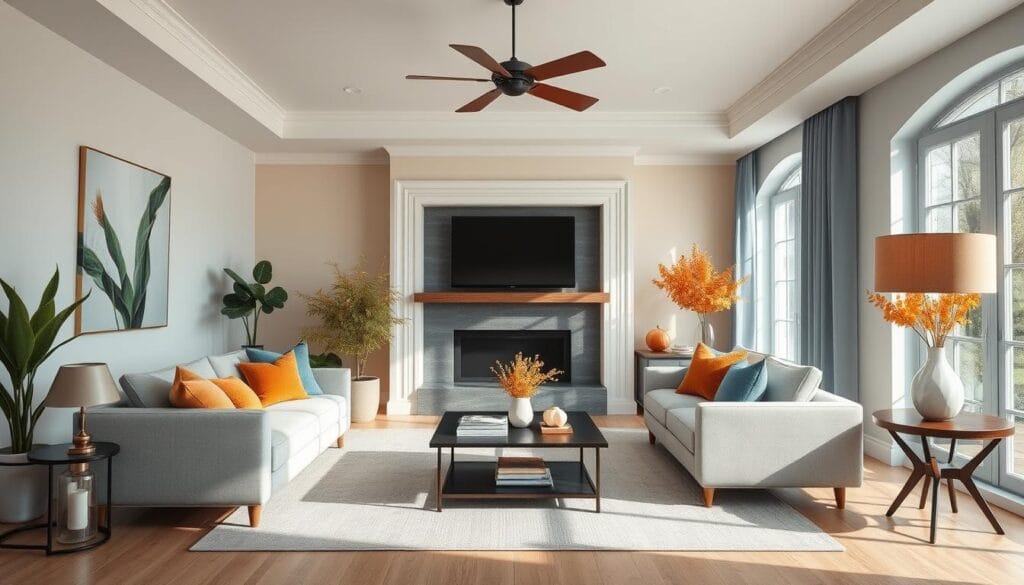
Choosing colors for your living room needs careful thought about lighting. Natural and artificial light can change how colors look, leading to surprises. Test paint and fabric samples under different lights to make sure they fit your design.
Warm lighting, like incandescent bulbs, makes reds, oranges, and yellows pop. Cool lighting, such as daylight bulbs, highlights blues, greens, and purples. Using lights you can adjust helps create a space that looks good all the time.
Also, using mirrors and shiny surfaces can make your round rugs stand out. This makes the room feel brighter and more welcoming. It also brings out the colors and patterns of your rugs.
FAQ
How can I match colors to complement the overall design of the room aesthetically?
What are the fundamentals of color theory in interior design?
How can I create harmonious color palettes for my space?
What is the power of complementary colors in room design?
How can I coordinate color for round rugs and living room decor?
How can I work with neutral color schemes as a foundation?
How can I blend natural and bold color combinations?
How can I strategically place colors for visual impact?
How can I incorporate seasonal color trends while maintaining a timeless appeal?
How does lighting affect the appearance of colors in a space?
Source Links
- How To Skillfully Mix, Match, And Coordinate Rugs Like A Pro – https://www.stonegableblog.com/how-to-mix-and-match-rugs/
- Coordinating Rugs with Other Home Decor Elements – https://the-rugs.com/blogs/interior-design-guides/coordinating-rugs-with-other-home-decor-elements
- Color combinations for rooms – 11 winning color pairings approved by interior designers – https://www.homesandgardens.com/advice/color-combinations-for-rooms
- How to Use the Color Wheel to Pick the Right Palette for Any Room – https://www.bhg.com/decorating/color/basics/color-wheel-color-chart/
- Color Psychology in Interior Design – Connecticut Design Build Contractor | Fine Home Contracting – https://finehomecontracting.com/color-psychology-in-interior-design/
- Mastering The Art of Choosing The Perfect Color Palette – https://www.stonegableblog.com/color-palette-and-decorating-style/
- The Rug Guide: How to Choose a Rug by Room Color – Chris Loves Julia – https://chrislovesjulia.com/the-rug-guide-how-to-choose-a-rug-by-room-color/
- Decorating Tips for Floral Rugs – https://boutiquerugs.com/blogs/boutique-blog/decorating-tips-for-floral-rugs?srsltid=AfmBOopREaV4I8FQ-ppxqBS71HZGgKHWICU08MHvh6irjyHWU-58mAer
- Looking to Redo Your Living Room? Start with These Designer-Approved Ideas – https://www.elledecor.com/design-decorate/room-ideas/g3490/best-living-room-ideas/
- How to pick a rug color? A Guide to Craft Your Ideal Space – https://therugdecor.com/blogs/blog/how-to-pick-right-rug-color?srsltid=AfmBOor1u7aMnvPuyWHeLrpdwADhTx7-Zcu9Md6YDQd2-zqZJ_5PfxZ8
- Love Your Home Again with These Simple Decor Ideas – https://www.julieannrachelle.com/blended-decor-blog/magazine-feature-how-to-update-your-homes-decor
- Home decoration ideas with round rugs – https://kudenrugs.com/blogs/kuden-perspectives/home-decoration-ideas-with-round-rugs?srsltid=AfmBOoqFwwt9h9RNk-LIeFjF96oXLlDTRC9r1hTHV_QG46aaJI5uwpiB
- Round Rug Reading Corner – https://www.pinterest.com/ideas/round-rug-reading-corner/912041155566/
- Round Rug Round Table – https://www.pinterest.com/ideas/round-rug-round-table/914283498348/
- How To Coordinate Rugs In An Open Floor Plan Or Adjoining Rooms – https://www.worthingcourtblog.com/how-to-coordinate-rugs/
- 33 Living Room Color Schemes for a Beautiful, Livable Space – https://www.bhg.com/decorating/color/schemes/living-room-color-schemes/
- Spring Decor: Using Accessories to Add Color to a Neutral Home – https://designthusiasm.com/spring-decor-accessories-add-color/
- How To Layer Rugs Like A Pro – https://www.makingjoyandprettythings.com/create-perfect-layered-rug-look/
- 50 Designer Living Room Color Combinations That Are Anything but Dull – https://www.veranda.com/decorating-ideas/color-ideas/g27455857/living-room-color-combinations-scheme/
- 94 stylish living room ideas to copy now – https://www.houseandgarden.co.uk/gallery/living-room-ideas-and-designs
- The Art of Interior Design: Mastering How to Decorate with Rugs – https://medium.com/@walee2pv/the-art-of-interior-design-mastering-how-to-decorate-with-rugs-80bb7e1bbe16
- Living Room Rug Replacement & Size Guide – https://www.povison.com/blog/buying-guide/living-room-rug-placement-size-guide.html
- Braided Rugs-Style Tips and Ideas – https://braided-rugs.com/blogs/decor/braided-rugs-style-tips-and-ideas?srsltid=AfmBOoo_jXG2jkkb21z91hioiGls_T8TQ9C0837ENql8onF4LCokZ-s8
- Fall color schemes – 17 on-trend colors to decorate with this fall – https://www.homesandgardens.com/ideas/fall-color-schemes
- Top Fall Design Trends for Tuscaloosa & Birmingham Homes – https://www.toulmincabinetry.com/blog/fall-2024-interior-design-trends
- Enhancing Interior Design with the Interplay of Lighting and Area Rugs – https://apadanarugsandcarpets.com/blogs/news/enhancing-interior-design-with-the-interplay-of-lighting-and-area-rugs?srsltid=AfmBOoq3_tyNC2GUJ09cz04XbAb_sS_ph5hv0NbFbovNEo1N7D6_bIdV
- Tips For Styling a Round Rug in a Living Room – https://www.decoist.com/round-rug-in-living-room/

